Toronto Live City Map
A full-stack geospatial web application that serves as a real-time operations dashboard for the city of Toronto. Designed as a centralized platform for exploring public transit, emergency presence, and civic infrastructure.
 React
React
 JavaScript
 TypeScript
 Leaflet.js
 Node.js
 Express
 Vite
Vite
 ESLint
 Prettier
 Git & GitHub
 GitHub Actions
 Porkbun
 Railway
Table of contents
- Overview
- Key features
- Tech stack
- Architecture
- Technical challenges
- Other engineering decisions
- Data sources
- What’s next
Overview
Toronto publishes a lot of public data, but it’s scattered. Transit positions, emergency incidents, bike share status, and public amenities all live on separate city systems updated on separate schedules. Toronto Live City Map brings all of it into a single view, so instead of checking several different sites to understand what’s happening in the city right now, you just check one.
The backend pulls from seven public endpoints across six different formats (JSON, XML, GTFS, GTFS-Realtime, GBFS, and plain text), each with its own schema and refresh rate. It normalizes all the data into a consistent internal structure, then serves it to the frontend.
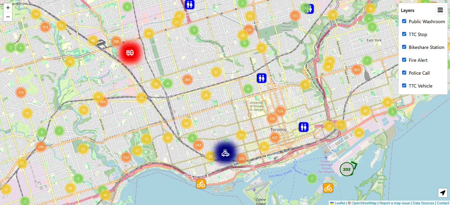
Key features
- Live TTC vehicle tracking: bus and streetcar positions update every 10 seconds; clicking a vehicle shows route, vehicle ID, bearing, speed, and occupancy. Train data isn’t publicly available, so it’s not included.
- Police and fire activity: active incidents refresh every 20 minutes for police and every 5 minutes for fire, with call type, cross streets, dispatch time, alarm level, and units sent.
- Bike Share Toronto stations: live dock and bike availability every 10 seconds, static station details refresh daily.
- Public washroom locations: status, hours, address, and accessibility details, refreshed daily.
- TTC stops and stations: static stop data refreshed biweekly, with arrivals every 30 seconds and service alerts every minute.
Tech stack
Frontend
- React (with CSS modules)
- JavaScript
- TypeScript
- Leaflet (with MarkerCluster and LocateControl plugins)
Backend
- Node.js
- Express
- TypeScript
Communication
- REST (static and on-demand details)
- Server-sent events (live updates)
Testing
- Vitest
Code quality
- ESLint
- Prettier
CI/CD
- GitHub Actions (linting and tests)
- Railway (automatic deploy)
Hosting & SSL
- Railway
Domain & DNS
- Porkbun
Architecture
The frontend is a React single-page app built with Vite. The backend is a persistent Node/Express process rather than a serverless deployment, because Server-Sent Events need a long-lived connection to push updates, and serverless functions are built to terminate after a request finishes. Railway hosts both, with automatic SSL and a straightforward deploy path: a push to GitHub triggers linting and tests through GitHub Actions, and Railway deploys and health-checks the new version once those pass.
Data flows through the backend in two ways. Frequently changing information is normalized and pushed to connected clients over SSE as it updates. Less volatile information is updated on a schedule, and fetched over REST on demand when a user clicks a marker for more detail.
Technical challenges
Normalizing seven data sources into one
Each source has its own schema and its own idea of what a location looks like, so the backend converts everything into a shared internal structure before it reaches the frontend. A map component that renders a vehicle doesn’t need to know whether its data came from a GTFS-RT feed or a JSON endpoint; it always receives the same fields in the same shape. Scheduled background tasks handle the refresh side of this: fast-changing data is pulled often, static data is pulled rarely, and the frontend never has to ask for something that hasn’t changed.
Rendering thousands of markers without slowing down
Leaflet creates a DOM element per marker, which becomes a real performance problem once thousands of vehicles, incidents, and stations are on screen at once, especially during pan and zoom. Three changes addressed it: marker clustering (via Leaflet MarkerCluster plugin) groups nearby points when zoomed out and splits them apart on zoom in; viewport-based rendering keeps markers outside the visible area out of the DOM entirely, with pan/zoom recalculation debounced so continuous dragging doesn’t trigger it on every frame; and marker reuse matches incoming data to existing markers by ID, updating in place instead of tearing down and rebuilding the whole set on every refresh.
MarkerCluster introduced its own complication: when a marker moves between clusters, the plugin removes and recreates its DOM element, which resets any CSS transition applied to it. Smooth position interpolation through CSS wasn’t reliable as a result, so marker movement is animated manually with requestAnimationFrame, interpolating between the previous and new coordinates on every frame regardless of what MarkerCluster does to the underlying DOM.
Fixing a memory spike in a 4-million-row file
The TTC’s GTFS stop time data is a text file with over 4 million rows. The original naive implementation loaded it into an array with one element per row, which meant millions of strings held in memory simultaneously before any of them were used, a worst-case space complexity of O(mn) for m columns and n rows. Switching to a generator-based approach fixed it: the backend processes one row at a time, extracts only the field it needs, and lets the rest be garbage collected immediately, bringing space complexity down to O(m) and closer to O(1) in practice since most columns are never used. The issue didn’t surface in local development on a machine with 16GB of RAM; it only became visible once the app was deployed to a server with a tighter memory budget.
Making an interactive map accessible
Maps resist accessibility in a specific way: the spatial relationships between markers can’t be read out in a meaningful sequence the way a list or table can, so the usual patterns don’t directly apply. A few problems were worth solving properly.
Markers carry ARIA labels describing what they are, whether more detail is available, and what action is possible, so a screen reader user has context before interacting. Popups move focus in on open and return it to the originating marker on close, so keyboard users don’t lose their place.
The harder problem was structural: Leaflet appends its control container (zoom, locate, attribution) after the map pane in the DOM, and since that pane can contain thousands of interactive markers, a keyboard user has to tab through all of them before reaching any control. The fix was a skip-navigation button that moves focus directly to the control container. It’s implemented as a button rather than an anchor link because an anchor would append a fragment identifier to the URL, and the URL is already used for layer state management, so changing it during accessibility navigation would interfere with the application’s routing. Since the app requires JavaScript to function, using a JavaScript-powered button doesn’t remove functionality for any users.
Layer controls are custom-built rather than relying on Leaflet’s defaults, which aren’t keyboard-friendly out of the box. Animations are reduced or disabled when the user has prefers-reduced-motion set.
Other engineering decisions
- URL-based layer state: active map layers are encoded in the URL rather than kept only in client state, so a configuration can be bookmarked or shared, and the frontend knows what to fetch before making any request.
useReffor the Leaflet instance: the map object and layer groups are stored in refs rather than component state, since they don’t need to trigger React re-renders.divIconmarkers: lightweight HTML-based icons instead of image assets, since the map can have a large number of markers on screen at once.- In-memory data storage: processed datasets are kept in server memory for speed and simplicity rather than an external cache. The tradeoff is that a restart or crash means re-downloading and re-parsing everything, causing a temporary memory spike. The current setup also only works correctly with a single server instance. If a second instance were added for load balancing, each would maintain its own isolated copy of the data, so clients routed to different instances could see different state. Redis would solve this because it runs as a separate process that all instances share, so a write from one server is immediately available to the others. It is still in-memory and fast, just no longer tied to a single process. The backend is structured so that replacing the in-memory store with Redis later would be a contained change.
- Native
<dialog>for data attribution: the attribution panel uses the HTMLdialogelement for built-in focus management, keyboard support, and escape-to-close, while staying mounted in the DOM so search engines can still index it. - Obfuscated contact email: the contact address is constructed dynamically on user interaction rather than placed in the HTML as plain text, to reduce automated scraping while satisfying OpenStreetMap’s tile usage attribution requirement.
Data sources
All data is used under the Toronto and Ontario open government licenses, from seven public endpoints:
- Surface Routes and Schedules for BusTime
- TTC BusTime Real-Time Next Vehicle Arrival (NVAS)
- TTC GTFS-Realtime (GTFS-RT)
- Bike Share Toronto
- Park Washroom Facilities
- Toronto Fire Active Incidents
- Toronto Police Service Calls for Service
What’s next
Creating a congestion layer using traffic flow data would make the map more useful for trip planning. Public events (street closures, festivals, anything that temporarily changes the state of the city) would be a good addition too.